Colors are wonderful descriptive analogies because they exist along a spectrum with the violet and blue end having the opposite quality as the red and orange end. Temperature intuitively fits into the color spectrum, with warm reds and cool blues. Color is also used in all sorts of design to elicit different emotions, like peaceful open-sky blues, welcoming greens, and cozy browns.
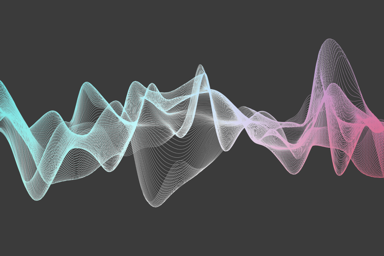
Recently color has been used as an analogy for the different combinations of low, medium, and high pitched sounds that make up steady background noise. This is mostly due to recent research pointing out that white noise, which is a combination of all audible pitches, might not be best in all situations, particularly involving sleep.
Let’s take a look at how the color spectrum works, how it relates to background noise, and what the research has been finding out about the impact on sleep.
The color spectrum doesn’t mix
Most of us are familiar with white noise, and if not click on the file below.
White noise is the constant sound of digital static and contains all pitches that our ears can detect. It’s similar to the color white in that way because the color white contains all colors our eyes can detect. There are other colors of noise that can be analogized with color in a similar way, but not exactly. For example, pink noise is made by removing high-pitched noises from white noise. However, the color pink is usually thought of as a combination of white and red, not by removing anything. It gets more confusing when we realize that pink is a lack of green light. First let’s remind ourselves how we were taught colors work and how they actually are.
Color is added and subtracted
Our brains perceive sight and sound very different. Physically, the qualities of color and sound go from high to low, but for reasons that we’ll get into below color makes more sense as a wheel when it’s clearly a spectrum, as you can see below.
Most of us were taught that 3 primary colors- red, blue, and yellow- cannot be created and are combined to make 3 secondary colors- green, purple, and orange. Anyone who has tried to reproduce a realistic painting from just those 3 colors rapidly notices no combination makes white, black, or most browns. And on the color wheel, there is both magenta (sometimes known as hot pink) between violet and red and cyan (or light blue) between blue and green. Clearly red, blue, and yellow aren’t up to the task.

It makes more sense when we remember that paint color is pigment, and pigment removes most colors of light and reflects back one color. Red, blue, and yellow are actually just convenient pigments that can be mixed together to remove enough colors that quite a few hues can be represented, but a lot of reality is still missing.
Color printers take a different tack and use a cyan pigment ink (light blue), a magenta pigment ink (hot pink), yellow, and black against a white background to achieve considerably more hues than just the “primary” colors are capable of. As you can see in this cyan, magenta, and yellow wheel.
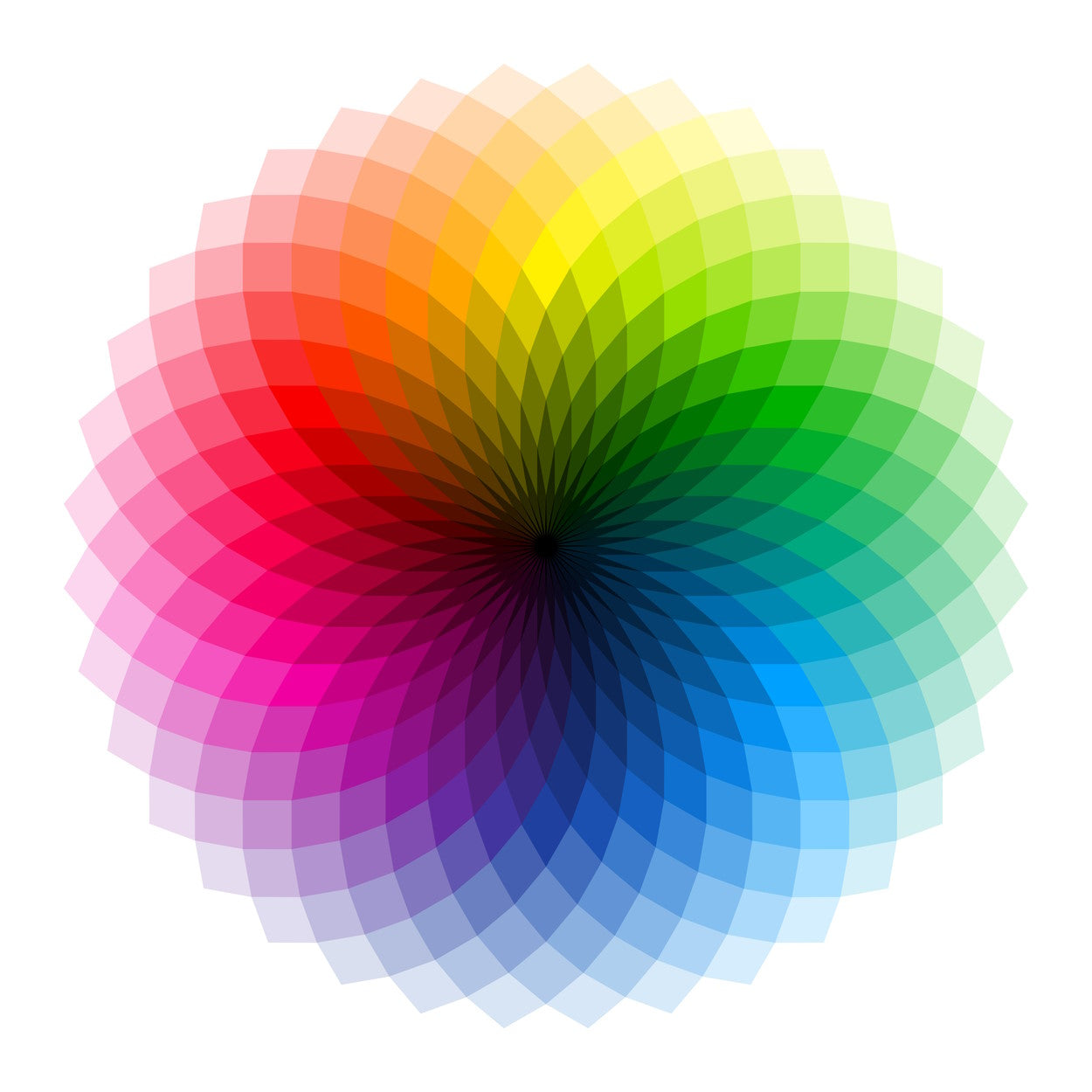
Photo-quality printers use around 12 pigments, and a color designer at a paint company could have 20 and still be on the lookout for more.
The electronic screen you are reading this on works completely differently, it doesn’t have any pigments. Instead of subtracting, it is adding colors together. With red, green, and blue, it can create all hues. When combined they create white and are projected onto a black screen, so all of the shades of reality are available.

This works because we can perceive three ranges of light using a combination of signals from three mechanisms, called cones, in our eyes. There are S cones that see short bluish waves of light, M cones that see medium greens waves, and L cones that see long red waves. The cones overlap a lot, so our brains have developed more of a wheel to account for all of the possibilities. Violet and red light, though they are at opposite ends of the color spectrum, look like they share color qualities because violet has such high energy it also activates the red cones in addition to the blue.

Colors of light are mixed by the overall combination. Yellow is its own color, and you can see above the M and L cones that pick it up. If those two cones are instead activated by a combination of green and red, our brain can’t tell the difference and will still see yellow. This is also how we see colors that aren’t on the spectrum like pink, magenta, or any brown. Magenta, shown below, is a combination of colors that activate the top (S or blue) and bottom (L or red) cones only.

Pink is like magenta but with more colored light that activates the green cone, which washes out the magenta to appear more white.

This is important to understand for the new ways that noise is being described, as we will get to below.
White Noise
Humans can detect sounds that vary from very low-pitched 20 Hz to very high-pitched 20,000 Hz, though most of us can hear a slightly narrower range. Like white light, white noise is even across all audible frequencies.
Here is a reminder from above:

White noise is helpful for sleep because it can drown out the high-pitched sounds that can penetrate walls and disrupt a good night. Using white noise can even help us to habituate to good sleep so we can sleep better even when white noise isn’t available.
White noise contains high-frequencies and can damage the hearing of young children if placed too close to their ears or is too loud. Also, when it’s not covering up disturbing sounds, white noise alone doesn’t seem to have a very strong effect on sleep.
Pink Noise
The new rage is pink noise. Pink noise has less high-pitched sounds than white noise. In an analogy to the visual spectrum, it’s supposed to evoke the concept of less high-energy blue, even though it’s the absence of green light that makes a pink color. The technical definition is that it decreases by three decibels for every octave increase in pitch.
Here is an example:

The suitability of pink noise is intuitive because natural sounds tend to fall along this same distribution. Simply put, high-pitched sounds require more energy and are more rare than run-of-the-mill low pitched sounds. Falling water, waves, wind, are all examples of pink noise, though urban sounds like passing traffic or whirring fans can also create a similar-pitched soundscape.
Though there is still a lot of research to be done, early findings are seeing that pink noise makes it easier to fall asleep, can help to make good sleep more consistent, and make deep sleep more restorative.
Red Noise
Following pink noise is red noise, which decreases by 6 decibels for every octave and has mostly low-pitched sounds. It’s also called Brownian noise not because of the color brown, but for Brownian motion, which is the random motion of particles whose momentum drops off over time at a consistent rate.
This is red noise:

There is a lot less research on red noise, but one study has found it has similar positive effects to pink noise when used as background noise during work, but is not quite as effective.
Green Noise
Up the middle of the spectrum is green noise. This range of pitches has very little research around it, though TikTok influencers seem to be happy with it. The current research is pointing out that the reduction of higher-pitched sounds seems to bring better benefits than white noise, and green noise lacks those. If the other hues of noise aren’t working for you, then green noise might be good to try.
This is green noise:
Blue Noise
Blue noise is analogous to pink noise but in reverse, so the low sounds are reduced and the higher sounds are louder. It sounds a lot like screeching and no one has bothered to test it for sleep, though high-frequency noises may be useful in treating tinnitus.
It sounds like this:

Violet Noise
Brown noise is to violet noise like pink noise is to blue noise. This combo of pitches is getting close to nails on a chalkboard. We couldn’t find an example of violet noise, likely because no one wants to listen to it.

Black Noise
There is no official definition for black noise, but if color is used as an analogy, it would be acoustic conditions that absorb all frequencies of sound. Audio recording studios employ different ways to minimize certain pitches of noise to capture an isolated recording. Scientists at a laboratory in Minnesota have created a place so black to sound that one can apparently hear all of the tiniest sounds our bodies make that are usually drowned out by the world, in what is surely an experience antithetical to sleep.
Keep up to date on what your air is up to on Facebook, Instagram, Twitter, and on the Molekule blog.
